Monday 28 December 2015

Vanity Fair - the art deco years.

A number of magazines have been published under the name of Vanity Fair. The first of these was an American publication that ran from 1859-1863, whilst the most recent version, also American commenced in 1983 and covers fashion, culture and politics. A friend of mine recently gave me a gift of 100 postcards featuring covers from the 1913-36 version of the magazine, many of them in the art deco style and designed by such luminaries as artists Miguel Covarrubias and Eduardo Garcia Benito.

October 1927 edition, Eduardo Garcia Benito.
Edited by Conde Montrose Nast, the magazine focused on fashion and popular culture. Nast employed Frank Crowinshield as his edit who in turn put together a formidable editorial team consisting of Dorothy Parker, Robert Benchley and Robert E. Sherwood. These three were original members of the fashionable set that became the Algonquin Round Table, meeting at the hotel of the same name. Their escapades can be seen in the 1994 movie Mrs Parker and the Vicious Circle. Interestingly, Benchley was played by his grandson. As well as this core team, Vanity Fair also attracted writing from the likes of Aldous Huxley, T. S. Eliot, Gertrude Stein, Thomas Wolfe, P. G. Wodehouse and Ferenc Molnar. By 1925 it was competing with The New Yorker for the position of top publication for America's cultural elite. 

March 1928 edition, Eduardo Garcia Benito
August 1929 edition, Eduardo Garcia Benito
June 1930 edition, Eduardo Garcia Benito
Competition between magazines was (and is) fierce and in order to win and retain followers many of the most prominent artists of the 1920's and 1930's were employed to design front covers that would stand out from the competing titles and that would be modern and stylish. Some of my favourite covers from this period were the work of the already mentioned Eduardo Garcia Benito.  Born in Spain in 1891, he studied in Paris where he mixed with Picasso, Gris, Modigliani and Gaugin, establishing himself as a portraitist, illustrator and decorative artist. He exhibited at the Antwerp Expo in 1920 before going on to illustrate a number of French newspapers and to paint portraits of the famous, including of actress Gloria Swanson. The covers I have selected here are typical of his art deco period, three of them displaying super fashionable couples - the June 1930 edition influenced one by developments in Asian deco, and the fourth showing a group of friends at the theatre - perhaps based on Mrs Parker and her followers!

Mexican artist, Miguel Covarrubias also produced covers for Vanity Fair. After studying in Mexico City, he moved to New York where his countryman, the poet Jose Juan Tablada introduced him to the city's cultural elite which led to him working for several magazines. He worked in a range of genres including caricature, book illustration and painting. Covarrubias loved the New York jazz scene, was friends with Langston Hughes and Zora Neale Hurston and visited Harlem jazz clubs in the company of Eugene O'Neill. This love of jazz resulted in his producing illustrations based on the musicians and jazz club patrons, several of which appeared in the magazine. The examples of his work included here are from 1932 of a very art deco stylised female tennis player and from 1936, an image entitled Bali Beauty.
February 1936 edition, Miguel Covarrubia.
August 1932 edition, Miguel Covarrubia


Artists who worked in other styles were also employed. Italian Futurist, Fortunato Depero produced a wonderful cover for the July 1930 edition, showing a fiendish figure smoking one cigarette with another one impaled on his devilish horns. The striking image together with the bright red, green and orange colours must have encouraged many purchases. Depero also worked as a sculptor and has further claims to design fame having been responsible for the Campari Soda bottle still used today and for a famous poster for San Pellegrino's magnesia.
Many other artists worked for the magazine during this period and several of them continued to produce work for the magazine after it merged with Vogue in 1936. Those 23 short years between 1913 and the merger produced some of the most influential art deco fashion illustrations ever, many of which are still in demand either as posters or in postcard format. A few more of my favourites are included below. A big thanks to my friend Pam for a great present!

July 1930 edition, Fortuanto Depero
June 1929 edition, Marion Wildman
March 1930 edition, Constantin Alajalov.
June 1931 edition, Wadsworth.

Sunday 6 December 2015

Picture Post 48 - Newspaper House, Melbourne


Melbourne has one of the largest and best preserved collections of art deco and modernist buildings in the world. This, together with its excellent cafes and restaurants, many theatres, galleries and museums makes it one of my favourite cities. I have visited Melbourne three times and plan to be there again next year when visiting relatives in Australia.

Although the best examples of art deco and modernism can be found in the city's many suburbs, there are some superb examples in the Central Business District (CBD). Newspaper House at 247-249 Collins Street was built in 1884, designed by architects Stephenson and Meldrum for the former Herald and Weekly Times newspaper. A little early for art deco you might think, but the building's facade was gloriously reshaped in 1932 when it was covered with a mosaic mural designed by Napier Waller. Designed to celebrate humanity's technological advances it shows various methods of transport and international communication with ships, planes and cars - remember this was  along time before the age of Facebook and twitter! The work was commissioned by the Murdoch family and designed at the suggestion of Theodore Fink, a politician, patron of the arts and one of the newspaper's directors. The mural is at first floor level and bears the text I'll put a girdle round about the earth -  a quote from Puck in Shakespeare's A Midsummer Night's Dream.


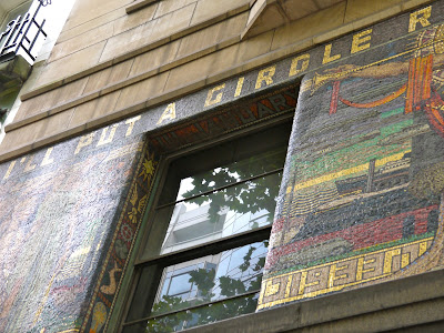
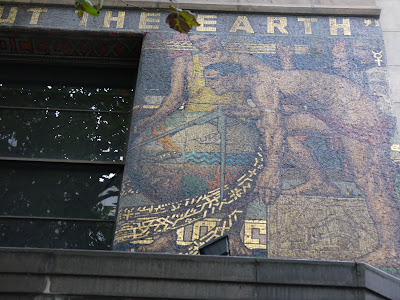
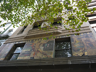
It is affixed to slate panels connected to the brickwork with copper dowels and is designed in three sections divided by two windows. The mural is well preserved and its vibrant colours appear textured and to have depth. The detail carries on from the facade into the recesses that accommodate the windows. It is best viewed and photographed from the opposite side of the street. As in most big cities, people are too busy to look up and enjoy this beautiful piece of street art or don't know it's there or have forgotten about it. Each time I have photographed it, the mural has attracted a little crowd - first as people stop to see what the tourist is so interested in and then to admire Waller's work for themselves, either re-connecting with it or seeing it for the first time. 

Waller, who studied and lived in Melbourne designed two other murals in the city, one in Temple Court, Collins Street and another at Monash House, William Street. He was also responsible for the mosaics and stained glass windows in the Australian War Memorial in Canberra. His achievements are particularly outstanding given that he lost his right arm when serving in France during the First World War. Determined to continue with his art he taught himself to draw with his left arm and continued working.

Newspaper House was sold to a Singaporean construction company in May 2015 for the staggering sum of $23 million (Australian dollars) - just over £11 million. I will be photographing it again in May 2016!


You can see more pictures of Melbourne's wonderful art deco buildings here.